


OMA wilfully subverts expectations at its Glasgow Maggie’s Centre, which melts unassumingly into the background.
“荧光灯反射在光亮的乙烯基地板上,弹簧门采用了呕吐阴影的贴面和装甲踢板,绿色的墙壁和无处不在的保护硬件——防止手推车、轮椅和建筑。”
This is the language of the contemporary hospital, as described in the Architecture of Hope, Charles Jencks and Edwin Heathcote’s recent book on the Maggie’s Cancer Caring Centres initiative — and one of the main motivations to start the programme in the first place.
More precisely, it is a description of a photo of a corridor in Glasgow’s Gartnavel General Hospital, within whose grounds a new £2.6 million Maggie’s Centre by OMA has just opened, funded by cancer charity Walk the Walk.
“这是我们从一开始的关键形象,”项目建筑师理查德·霍林顿说。“我们试图创造NHS走廊的解药:一些明亮、开放、充满视野的东西。”
He is speaking to me from Qatar, where the office has just won a vast airport project, and where several other buildings by Rem Koolhaas’ firm — for Doha’s satellite Education City — are beginning to rise out of the ground. Before Maggie’s, Hollington was masterplanning a new 70ha district for Milan’s outskirts.
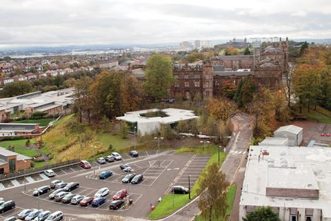
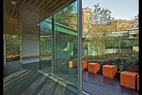
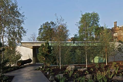
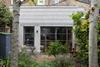
Nestled into a raised, sloping site to the west of the hospital, barely legible among the trees, this little cluster of glass boxes is quite a leap of scale. It looks out upon a jumbled NHS-scape of brutish structures, from the 1970s high-rise fortress of the main hospital, to the beige-clad expanse of the Beatson West of Scotland Cancer Centre, built in 2007 — the second largest such facility in the UK, serving a population of 2.8 million, and the reason for locating the new Maggie’s centre here.

OMA chose a site removed from this din across a car park, retreating into a wooded slope beneath the looming Gothic facade of an abandoned institutional building. Built as the Glasgow Royal Lunatic Asylum in 1843, East House is now a spooky vacant shell, awaiting renovation as flats. It provides a charged backdrop to this quiet corner of the sprawling campus — detached from the world of sheds floating on the sea of tarmac below — where the centre now forms an atmospheric relationship with the Victorian pile. It shimmers like an ethereal pavilion, dropped into the grounds of the derelict manor.
This is the eighth new-build Maggie’s Centre since the first opened in 1996. Rem Koolhaas joins an all-star cast of Frank Gehry, Zaha Hadid, Richard Rogers and Richard MacCormac — soon to be accompanied by Piers Gough, Kisho Kurokawa and Ted Cullinan, among others. Every architect is given the same brief — a light and welcoming home from home (“a home people wouldn’t have quite dared build themselves”) — yet each reinvents it in their own inimitable style.
詹克斯说:“每座建筑都像是培养皿中的一个实验。”詹克斯帮助他已故的妻子玛姬·凯瑟克建立了癌症护理中心。“他们都是迷你偶像。”
It is as if a Case Study House has been chopped up into chunks and redeployed across the site in a scrambled cloister
每个中心都是名人建筑杰作的精华,是一篇浓缩的饰品论文,这一观点并非没有受到批评。这个系列有一种喜鸟式的混乱,类似于罗尔夫·费尔鲍姆的维特拉校园,或阿兰·德波顿的度假屋——只是因为一个治愈的议程而变得高贵。
“People accuse me of saying that iconic architecture can cure cancer,” says Jencks. “We only argue that bad buildings make people feel worse — and mean that doctors don’t show up.”
As the grandfather of current-day architectural criticism, Jencks is well placed to argue the case, and to draw on an illustrious network of former students and friends to help him do it.
“雷姆必然会这样做,”他说,并回忆起他与库哈斯和马德隆·弗里森多普的长期友谊,后者是建筑师的妻子和OMA的联合创始人,因为他们在20世纪70年代初是他在建筑协会的学生——还有他已故的妻子。“我们是很棒的四人组,”他说。“雷是那个不理解我的学生。”
That Koolhaas was the stubborn student is not difficult to believe, although it is particularly interesting in this context. His wilful contrarianism continues unabated: unlike most of the centres to date, Maggie’s Gartnavel bucks the trend for formal novelty and signature styling. With its low-lying orthogonal walls of blank concrete and seamless glass, the building seems determined not to join Jencks’ menagerie of mini icons.
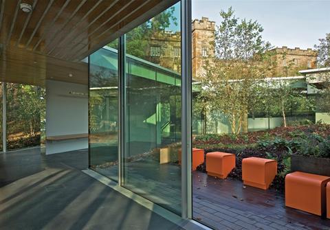
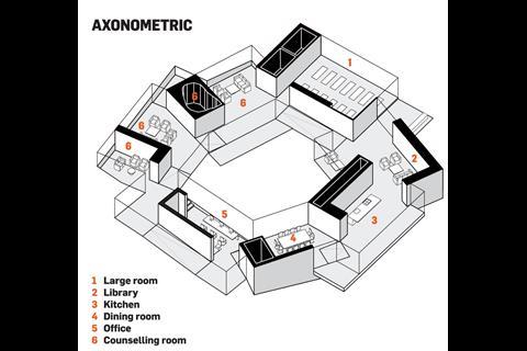
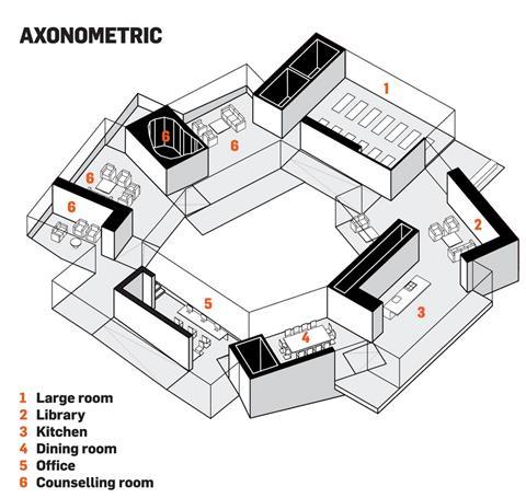
“The last thing you need as a cancer patient is to be aggressively confronted by architecture,” says Hollington, explaining that the firm wanted to make the building as “background” as possible. Its approach was thus pragmatic: the centre is disaggregated into its constituent rooms, each expressed as individual blocks, arranged in an interlocking circle around a planted courtyard, according to adjacencies of use. The more private spaces, including the three counselling rooms, are to the north, slightly submerged into the sloping site, while the public functions of kitchen, dining room and library lie to the south, open to both sides and flooded with light.
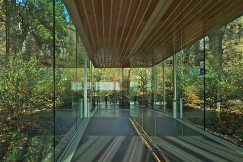
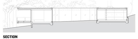
Exploiting the site’s gradient, the rooms step down to the south, via gentle ramps, and up to the north, creating different levels of intimacy through subtly changing ceiling heights. The whole structure is unified by a 350mm-deep concrete slab roof, a continuous datum that ties the building together under one plane, oversailing the facade in places to shelter small external terraces. Its depth comes from the vast spans required, cantilevering up to eight metres at points, which makes it read like a chunky, overhanging lid — earning the project cheeky comparisons with the Flintstones’ house during its development in the office.
现在建成了,几乎没有原始的痕迹。相反,这座建筑是用古典现代主义的光滑、匿名的语言表达的。这是库哈斯最近在建筑中追求“通用”的产物,渴望“拥有壮观品质的不起眼的建筑”,正如OMA所称,这是对标志性项目的有意识的拒绝。
In the office, the scheme has been run by partner Ellen van Loon — the one who knows how to build — who is also responsible for the De Rotterdam building and the forthcoming Rothschild headquarters in London, both examples of stripped, slick office blocks, referencing Mies or Yamasaki in turn, but with a knowing twist.
Glimpsed through the trees, with its full height glazing, cantilevered floors and deep, projecting soffits, the Maggie’s Centre has strong echoes of a Case Study House — as if one has been chopped up into chunks and redeployed across the site in a scrambled cloister. It is another accomplished riff on the modernist archetype — clearly of the Van Loon stable.
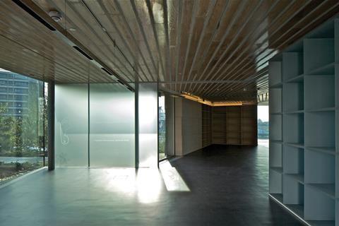
“It should feel like visiting the house of a friend.” says Tricia Crosbie from Maggie’s, as we step past a tree-trunk bench — a quotation from the Rotterdam Kunsthal — through the sliding glass door of the main entrance. (“If your friend lives in a John Lautner house,” I think to myself). The sleek 1950s feeling continues inside with the choice of materials, such as the planks of beech plywood, cast flush into the concrete ceiling, that follow the direction of each room (mirrored in concrete planks on the roof), and the use of full-height sliding walls that allow rooms to open up into a continuous fluid space.
It is perhaps the most open-plan of all Maggie’s Centres to date, the circuit of interlocking rooms defined only by a series of L-shaped figures, some the thickness of the wall, others swelling to incorporate shelving or services.
“We thought about it like a series of stage sets,” says Hollington. “What is the minimum you need to evoke a certain type of domestic space?”
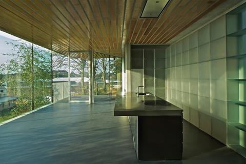
图书馆由一隅的木制书架界定,餐厅由靠墙的低矮l型长凳界定。厨房——一直是麦琪中心最重要的房间,人们的生活都围绕着一杯欢迎的茶——由一整面墙的半透明树脂储物柜构成,从一个隐藏的屋顶到后面照明。墙壁由树脂王和长期合作伙伴Vincent de Rijk建造,他为OMA 1998年的Maison à Bordeaux设计了类似的书架,墙壁发出淡蓝色的光,提供较凉爽的北光,以平衡这个朝南的房间。在每个案例中,无关的部分都被侵蚀了,家庭空间的序列解读了一系列被解构的房间设置。
The westernmost room, furthest from the entrance, houses the staff office. Just as open and accessible as the other areas, its
L-shaped wall is pulled back from the outer facade to provide a subtly ramped corridor — the transition space from the social, domestic world, to the more withdrawn, private sphere of counselling rooms.
It is a powerful space, entirely glazed on one side, with sliding doors leading out to a woodland landscape — designed by Harrison Stevens and Lily Jencks, Charles and Maggie’s daughter — and entirely clad in mirror-polished steel along the inner wall. Walking along the corridor, your pace is slowed by the slight gradient, there is a strange perceptual shift, as though you have been transported to the centre of the forest, with trees reflected on all sides. It is a place for pause, providing a distancing step outside on your way from public to private. It is also one of the few areas visually screened from the rest of the centre, the glazed cloister form and continually framed views allowing for little privacy in general.
高,慷慨的空间
One place you can be sure of seclusion is the loos — the brief specifies that they must be “big enough to take a chair and a bookshelf” and “private enough to have a cry”. Lined in walnut laminate, they are tall, generous spaces, although they feel a little too executive for tears.
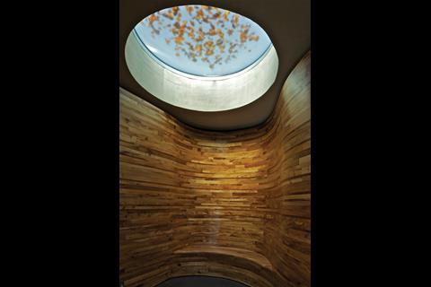
The northern edge of the building is composed of three counseling rooms, as well as a larger multi-purpose room and a tiny “womb room,” a grotto-like space of undulating elm walls, wrapped with a curvaceous bench and lit from an oculus rooflight. Produced by local furniture maker, Paul Hodgkiss, the warm, organic form provides an effective foil to the crisp, linear language of concrete and glass used elsewhere.
The other rooms are straightforward affairs, a sense of seclusion and cosiness provided by the lower ceiling heights, the fact you are semi-submerged into the landscape and the fireplaces floating in the walls. While the feeling of much of the project is positively Fosterian — immaculately poured concrete abutting frameless glazing and panellised veneer — I am reminded it is Koolhaas when the contractor points out the 6m-long timber door to the end room, which slides back to disappear into the wall — and which would require complete removal of the toilet to fix.
The brief for the loos specifies they must be ‘big enough to take a chair and a bookshelf’ and ‘private enough to have a cry’
The triumph of idea over practicality continues into the large multi-purpose room, whose entirely glazed corner walls can be slid back to open up the space to the entrance — although since they weigh half a tonne each, one might question this logic, given the weaker health of its users.
And where practicality triumphs elsewhere, aesthetics have slipped: doors used throughout the building were intended to be glass-reinforced concrete panels, but these proved too heavy to hang.
The resulting choice is a standard door blank, covered with polished plaster. It is a strange, smeary finish that jars with the in-situ concrete walls it is meant to ape.
Jencks is pragmatic about such details — not at all precious about the primacy of the architect.
“一个建筑总是要设计两次,”他说。“一次是建筑师设计,一次是客户控制。当我们进驻时,我们总是要调整我们的中心——这是一个微调的过程。”
他对麦琪电视网的新成员感到满意是理所当然的。他唯一担心的是所有坚硬的表面可能会有太大的回响。他开玩笑说:“我们可能得在天花板上铺地毯了。”
And is he disappointed by its anti-iconic form?
“It is iconic in its minimalism,” he retorts. “It is the disappearing icon!”
这当然是对的。尽管如此,我还是忍不住想,还有其他的建筑师在这个小尺度上——“一般的”原型别墅——做得很细致的极简主义,比那些更关注更大的、反问的问题的做法更好。
Project team
ArchitectOMA,ClientMaggie Keswick Jencks Cancer Caring Centres Trust,Implementation architectsKeppie,StructureSinclair Knight Merz,ServicesKJ Tait Engineers,LandscapeLily Jencks, HarrisonStevensFixed shelvesVincent de Rijk

2Readers' comments